Hey guys,
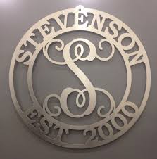
First post here! I'm having an issue with making a Monogram. I can put the text on the circle adjust it all around to where I want it but I am having an issue with joining the circle outline to the text. If I do a union the text becomes the stroke fill thickness, basically everything gets distorted. I guess I should mention that I am using this for CNC Plasma cutting so I need the cut paths. I need the inside circle about .25" thick so I can join the lettering in the center and the outside circle will be roughly 3-3.5" radius larger so I can wrap text around the border inside the outer circle but above the smaller circle. If anyone can point me in the right direction of how to achieve this or Barny style it to me that would be great. the pic below is what I am roughly trying to achieve.
Text for Monogram
Re: Text for Monogram
Welcome to the forum!
I'd love to get involved with cutting, lasering, 3D printing and other practical implementations. I'll have to take some time off work and throw myself into it one day
I'm thinking it's the circles that are throwing you off here. If you convert the relevant objects to paths, and then union, you'll get what you need. But be mindful of the circular "lines" around the monogram. How did you create them? With two concentric circles that have no fill and have a stroke of the thickness you want cut out? If so, you should convert Stroke to path, instead of converting Object to path!
Object to path will give 4 nodes out of a stroked circle, and Stroke to path will give you 8 nodes!
Once you have all shapes and text converted "Object to path", and circles converted "Stroke to path", it's easy to Union and you'll get the shape exactly as you see it before unioning.
Keep original objects (before converting to paths) in a separate hidden Layer, or make a copy of the document under a different name so you can edit it later if needed and come back to it if you make a mistake or change your mind.
just hand over the chocolate and nobody gets hurt
Inkscape Manual on Floss
Inkscape FAQ
very comprehensive Inkscape guide
Inkscape 0.48 Illustrator's Cookbook - 109 recipes to learn and explore Inkscape - with SVG examples to download
Inkscape Manual on Floss
Inkscape FAQ
very comprehensive Inkscape guide
Inkscape 0.48 Illustrator's Cookbook - 109 recipes to learn and explore Inkscape - with SVG examples to download
Re: Text for Monogram
Man I never thought about the Stroke to path.....But then again I haven't used it yet today will be the day then! That makes sense though cause when I did the Union all the text which was a path already took on the characteristics of the "stroke" which I had set to .25" as a starting point.
Re: Text for Monogram
Yes it can sometimes be confusing, because strokes are just "visual decorations" on a maths object. So when you do operations on those objects you can get unexpected results, parts disappearing, or strokes being applied on unexpected areas.
A good tip (especially for cutters) is to remember to view your drawing in Outline mode (Ctrl + KP5, or View > Display mode > Outline). Try creating two circles with strokes, convert one of them with Stroke to Path and view them in Outline mode. Although they look the same in Normal mode, they don't in Outline mode
A good tip (especially for cutters) is to remember to view your drawing in Outline mode (Ctrl + KP5, or View > Display mode > Outline). Try creating two circles with strokes, convert one of them with Stroke to Path and view them in Outline mode. Although they look the same in Normal mode, they don't in Outline mode
- Attachments
-
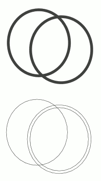
- Circle and Stroke to Path Outline
- strokedCirclesOutline.png (4.05 KiB) Viewed 2183 times
just hand over the chocolate and nobody gets hurt
Inkscape Manual on Floss
Inkscape FAQ
very comprehensive Inkscape guide
Inkscape 0.48 Illustrator's Cookbook - 109 recipes to learn and explore Inkscape - with SVG examples to download
Inkscape Manual on Floss
Inkscape FAQ
very comprehensive Inkscape guide
Inkscape 0.48 Illustrator's Cookbook - 109 recipes to learn and explore Inkscape - with SVG examples to download
Re: Text for Monogram
Worked like a charm! Thanks for the help it always seams to be the easiest little things on this program. I've only really been using it for a month so far and increased my cutting of custom signs and artwork ten fold.
Re: Text for Monogram
Wow that's some testimonial! I'm curious: what did you use before Inkscape, what were the problems and how did Inkscape solve them?
The community of people who use Inkscape in practical projects seems to be growing very fast, and we need to see how we can help them specifically. They're probably not using all the tools that visual artists use, and they need some extra tutorials and guidance about cutters specific issues... Do you have any thoughts on the name for this community?
And if you're not tired of my nosiness yet, if you can please post a photo of the real live boy, eh I mean, the final cutout
just hand over the chocolate and nobody gets hurt
Inkscape Manual on Floss
Inkscape FAQ
very comprehensive Inkscape guide
Inkscape 0.48 Illustrator's Cookbook - 109 recipes to learn and explore Inkscape - with SVG examples to download
Inkscape Manual on Floss
Inkscape FAQ
very comprehensive Inkscape guide
Inkscape 0.48 Illustrator's Cookbook - 109 recipes to learn and explore Inkscape - with SVG examples to download
Re: Text for Monogram
I think the appropriate name would be along the lines of Inkscape Metal art. Though it could also work with plotters for vinyl decals they do from what I see differ some in the ways the paths are used for cutting, but I may be wrong!? Before I was using or attempting to use Bobcad A great program for CAD drawings and very specific tolerance drawings. I figured there had to be an easier way! I looked into Corel draw and didn't quite have the interface I was looking for. Then I came across Inkscape. I started drilling youtube videos on questions I had and watching and learning. Now a lot of the content as I know now was from previous versions of Inkscape and some of the keystrokes they were using were not compatible in my latest and greatest version of Inkscape of course some searching around and trying different things I figured them out. I am definitely still a novice with the program and the main problem I have had was looking into the lingo everyone uses to refine my own searches.
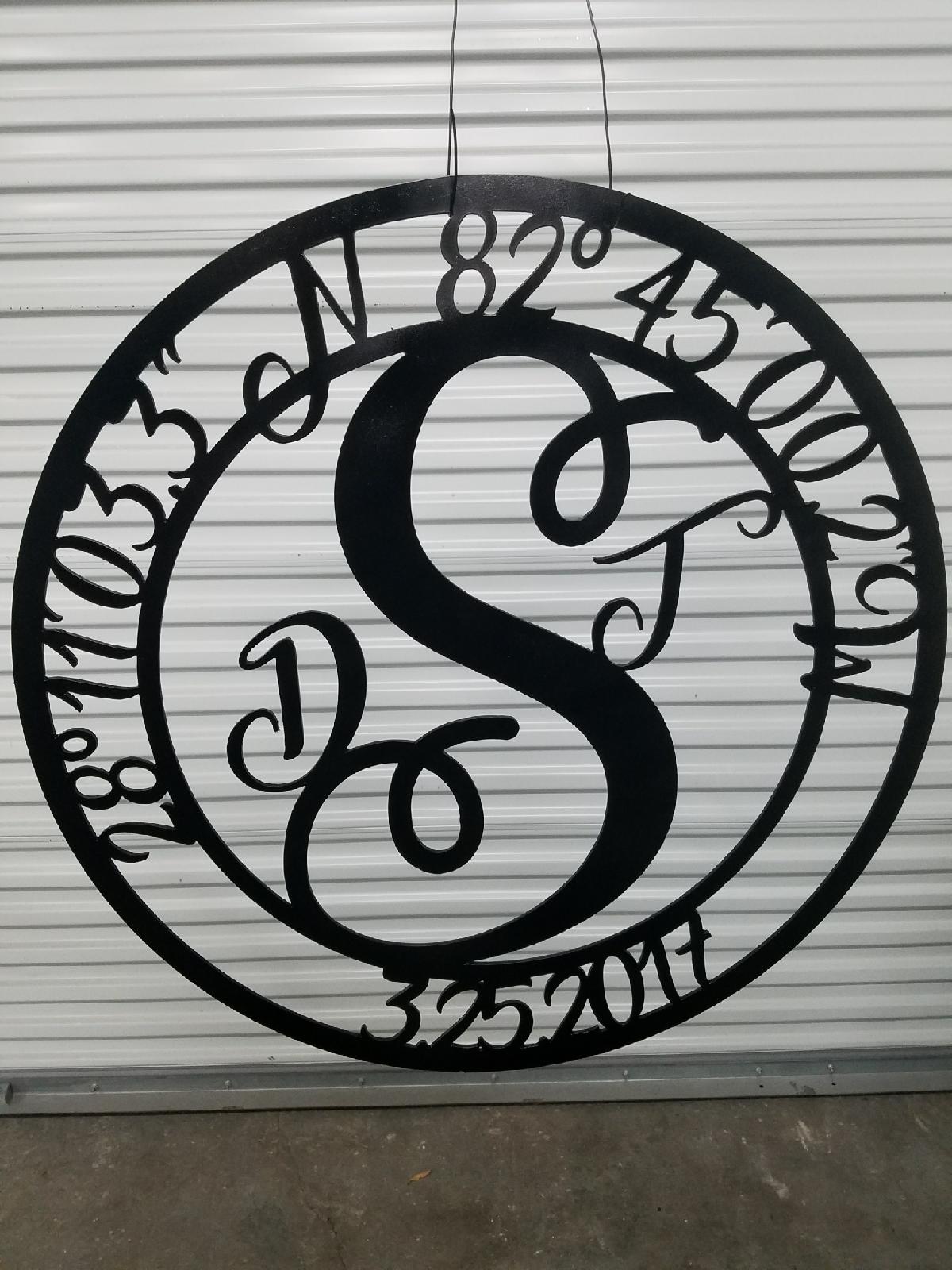
As for the piece I completed, here it is 24" Monogram with the Coordinates of the alter for the wedding up top, the date below and Large initial for their last name with the two smaller initials added to signify their first names. I don't know why it looks grainy in this pic, but came out very smooth and just as pictured in Inkscape
As for the piece I completed, here it is 24" Monogram with the Coordinates of the alter for the wedding up top, the date below and Large initial for their last name with the two smaller initials added to signify their first names. I don't know why it looks grainy in this pic, but came out very smooth and just as pictured in Inkscape
Re: Text for Monogram
I think the Corrugated door in the background was messing with my camera on my phone now that I look at it more!
Re: Text for Monogram
Yep, phone cameras tend to do a lot of 'optimization' - sometimes that works, and sometimes it doesn't.
But this thing is cool
But this thing is cool
Something doesn't work? - Keeping an eye on the status bar can save you a lot of time!
Inkscape FAQ - Learning Resources - Website with tutorials (German and English)
Inkscape FAQ - Learning Resources - Website with tutorials (German and English)
Re: Text for Monogram
Love what you did. I am new to Inkscape and think I followed all of this regarding the circles and stroke and object to path. I am wondering if there is an easier way to put the text in between the circles. I typed the text, put on path and then had to adjust each letter so it overlapped the circles so the union could be made. I did not mind doing that but was wondering if there is an easier way... still learning. I hope it works when I get back to the cutting machine this week.
Re: Text for Monogram
jeannez try creating a smaller circle than the one used for the rim, and put the text on that smaller helper circle. This way the text will overlap the rim "circle" and when you do a union of text with the rim it will join everywhere needed, if you set the helper circle and font size just so that every letter overlaps a bit.
just hand over the chocolate and nobody gets hurt
Inkscape Manual on Floss
Inkscape FAQ
very comprehensive Inkscape guide
Inkscape 0.48 Illustrator's Cookbook - 109 recipes to learn and explore Inkscape - with SVG examples to download
Inkscape Manual on Floss
Inkscape FAQ
very comprehensive Inkscape guide
Inkscape 0.48 Illustrator's Cookbook - 109 recipes to learn and explore Inkscape - with SVG examples to download
Re: Text for Monogram
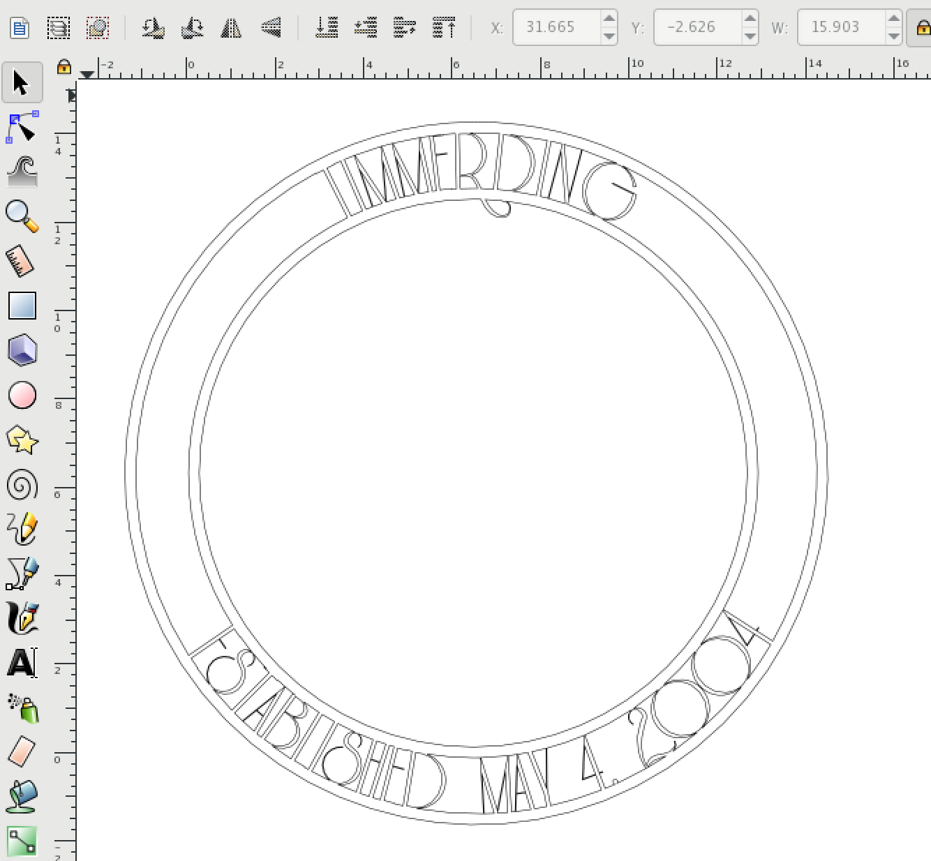
Thanks for looking at it! I appreciate the help. I think I did that...still playing with this. I don't think the font I used helped me out at all since it had so many steep points. Adjusting the letters individually was necessary to be able to read the letter. My current problem is when I add the large letter in the middle I am loosing the "cut outs" in the middle. I had someone help me at a class I was in. I think they "excluded" some nodes and I can't figure out how to do that so I get the cut outs of the "K"
- Attachments
-
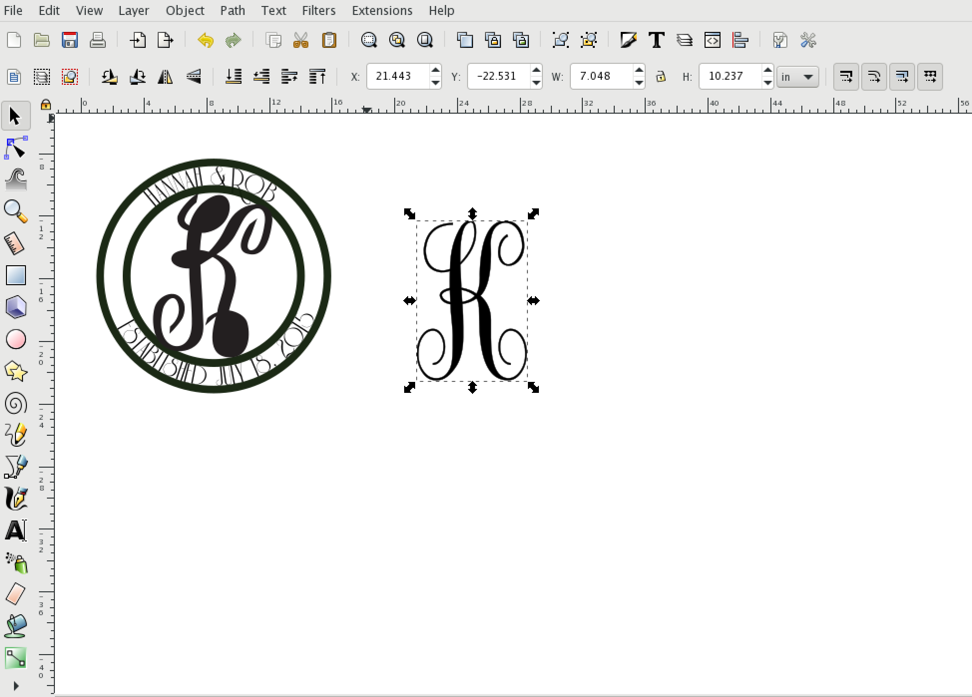
- Screen Shot 2018-04-11 at 8.51.08 AM.png (210.56 KiB) Viewed 1768 times
 This is a read-only archive of the inkscapeforum.com site. You can search for info here or post new questions and comments at