I'm stumped - Need to "thicken" lines in a logo....

Post questions on how to use or achieve an effect in Inkscape.
fast_ian
Posts: 4
Joined: Sun Apr 03, 2011 2:46 am

I'm stumped - Need to "thicken" lines in a logo....

Postby fast_ian » Sun Apr 03, 2011 3:04 am

Hi,

Firstly, *loving* Inkscape & the community here - I've got some great decal sheets (for model railroading) done as a complete newb! :)

However, I've read the FAQ's, searched the forums and even studied some of the tutorials, but am still coming up blank on this one. :(

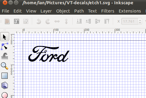
Final output will be a photo-etched stainless steel sheet of ~3"x3". I set up a 12"x12" drawing in Inkscape and started my layout - So far so good. I extracted the word "Ford" from the Ford logo - See the attached grab.

It will be *tiny* on the printer (to trick film via inkjet) and I want to increase the width of the word "Ford" - I don't want to make it bigger, just "expand" the black "in proportion" a little...... Does that make sense? [I do hope so!]

I guess I could paint a new line around the whole thing, but that's gonna be a PITA - Hopefully there's a better way?

TIA, cheers,
Ian
Attachments
ford.png
ford.png (33.56 KiB) Viewed 11233 times

Simarilius
Posts: 626
Joined: Wed Jun 06, 2007 2:37 am

Re: I'm stumped - Need to "thicken" lines in a logo....

Postby Simarilius » Sun Apr 03, 2011 3:54 am

Does it have a stroke applied? if not, try applying one, it should add material around the outside...

fast_ian
Posts: 4
Joined: Sun Apr 03, 2011 2:46 am

Re: I'm stumped - Need to "thicken" lines in a logo....

Postby fast_ian » Sun Apr 03, 2011 4:30 am

Simarilius wrote:Does it have a stroke applied? if not, try applying one, it should add material around the outside...


I cannot tell you happy you've just made me! :) :) [I've got a bunch of other "parts" that are gonna need the same treatment.]

Thankyou, thankyou, thankyou! - That's *exactly* what I needed - Awesome!

"Easy when you know how!"

Thanks again,
Cheers,
Ian

Simarilius
Posts: 626
Joined: Wed Jun 06, 2007 2:37 am

Re: I'm stumped - Need to "thicken" lines in a logo....

Postby Simarilius » Sun Apr 03, 2011 4:55 am

Happy to help, and welcome to the forum!

User avatar
flamingolady
Posts: 687
Joined: Wed Jun 10, 2009 1:40 pm

Re: I'm stumped - Need to "thicken" lines in a logo....

Postby flamingolady » Sun Apr 03, 2011 5:56 am

I see that you have your answer, just wanted to throw in another option for down the road as not all fonts have strokes that can be thickened so nicely. You can also duplicate the text and apply "Path", then "Outset", you can apply Outset as many times as you want, it grows each time, and, you can also change the color and/or move it around to create a shadow effect. There's so much Inkscape can do!
Welcome to the forum, there is so much great info around here.
dee

fast_ian
Posts: 4
Joined: Sun Apr 03, 2011 2:46 am

Re: I'm stumped - Need to "thicken" lines in a logo....

Postby fast_ian » Thu Apr 07, 2011 12:34 am

flamingolady wrote:.... There's so much Inkscape can do!


Indeed - Just lurking around here has answered the majority of my Q's thus far.

Welcome to the forum, there is so much great info around here.
dee


Thanks for the welcomes and the alternative approach. I think I'll be more of "taker" than a "giver" on here for a while - There are some *awesome* things being done by some very talented folk.

The photo-etch kit just recently arrived, and has some *significant* instructions for use and generating the artwork - As noted, it's "pure" black & white and needs mirroring for the back side of the etch - I've figured that out but am sure I'll have more Q's as I progress.....

Thanks again,
Cheers,
Ian


Return to “Help with using Inkscape”