Hi,
I am wondering is anyone could help me make the following picture with high precision ... ok i have no ide how to upload the figure. Well, it is basically a polar chart like this one : http://upload.wikimedia.org/wikipedia/c ... tality.jpg but it has 300 categories. i tried dividing a circle into 300 pieces but no matter how precise i am it is not mathematically precise. is there a way to do this with high precision?
any help appreciated
b
ps
and is it possible to make 30 concentric circles equally spaced such that radius of the following circle is 1/30 of the largest radius longer then the previous
Is there a way to make this with mathematical precision
Re: Is there a way to make this with mathematical precision
Hello,
Interesting job you have there
In my opinion. 300 divisions for a polar chart graph is not good. The ability of a graph, of display data in an easy way to understand is lost.
As I know, Inkscape for displaying circles or ellipses uses bezier curves, which If I'm not wrong, doesn't display them as exact circles. So matemathical precision is impossible (*). But for graphic representation it's a very good solution. For a naked eye, the difference is "undetectable".
Anyway, there is an extension on Inkscape to generate polar grids:
http://tavmjong.free.fr/INKSCAPE/MANUAL ... -PolarGrid
Based in these, You may construct your "wedges" by hand (or by mouse clicking). It will not be 100% mathematical exact, but as I said before, it's impossible to reach it on Inkscape. But graphically will look good
Other solution is using special programs for mathematical graphics, like GNUPLOT or this
http://www.loria.fr/~rougier/teaching/m ... polar-axis
and later exporting to SVG, for applying later the Final style on Inkscape
(*) I don't know if the same is true for another graphic computer programs, like Illustrator, or for CAD programs, like AutoCad
Please, if you found a solution share it
Greetings
If you have problems:
1.- Post a sample (or samples) of your file please.
2.- Please check here:
http://tavmjong.free.fr/INKSCAPE/MANUAL/html/index.html
3.- If you manage to solve your problem, please post here your solution.
1.- Post a sample (or samples) of your file please.
2.- Please check here:
http://tavmjong.free.fr/INKSCAPE/MANUAL/html/index.html
3.- If you manage to solve your problem, please post here your solution.
Re: Is there a way to make this with mathematical precision
Hi.
I agree what Hulf said, there is other programs out there that should be more than capable to do the job.
First I want to suggest is a program called Librecad. It's have many of the features of Autocad, exept from that it is open source.
Second you could try Geogebra. Need Java, and it probably makes the figures to look more fancy than Librecad because of line thickness and fill colors. However, being user of both programs I figured that working with many objects in Geogebra in a big project will probably cause you to loose overview because all objects need to have an unice name.
Therefore I would have preffered Librecad for this task.
Re: Is there a way to make this with mathematical precision
It is the Bézier curve, the segment of the path that cannot be exactly circular.
Basically the ellipse and circle objects are made up of 4 nodes and segments if you convert them to paths.
As far as I know development builds add more nodes, to make a higher precision.
The polar grid extension could make you a good image, however that draws ellipses -four nodes only-.
Nodes can be computed with high accuracy.
With the * tool you can draw poligons, convert it to paths, and make the nodes smooth to have a more accurate cirle.
You may try the interpolate extension or lpe too later on -to draw the parallel circles-, and maybe other things like the envelope extension, if really necessary to be more precise.
Also for high precision drawings increase the accuracy at the user preferences under the svg output options.
Re: Is there a way to make this with mathematical precision
It depends on what precision you are looking for. Are you more concerned about dividing the graph accurately, or that the curve of the bezier arcs is not absolutely and precisely circular?
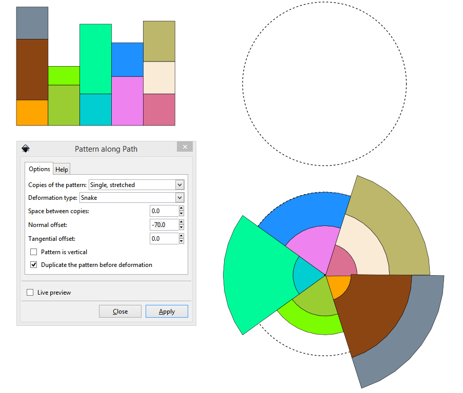
Here is a suggestion for how to easily and precisely convert a bar graph into a pie chart.
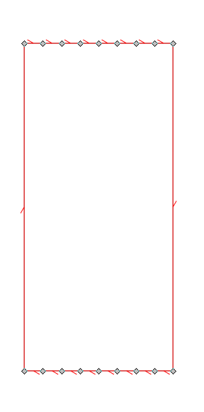
Note that for optimal results the rectangular paths for the blocks in the bar graph have to have their top and bottom segments subdivided a fair amount, more for wider segments.
At the very end there may be some inaccuracy from using stroked objects as seen here. Stroke later to avoid this. The final step would be to select the nodes at the center and align them to a single point (not done here to show the problem)
Your mind is what you think it is.
Re: Is there a way to make this with mathematical precision
Just a note to set segments curved on the pattern objects before running the extension. Bug or feature, but if you miss that step the resulting nodes will be connected with straight segments.
Re: Is there a way to make this with mathematical precision
Maybe have a look at sunburst or other displays at https://github.com/d3/d3/wiki/Gallery
It displays (dynamic) data using SVG (most of the time)
It displays (dynamic) data using SVG (most of the time)
 This is a read-only archive of the inkscapeforum.com site. You can search for info here or post new questions and comments at

