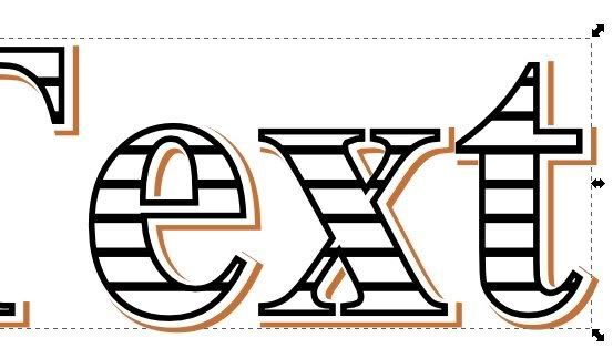
Hi!
Am pretty new to Inkscape after years of faking/making it with the Gimp.
Am trying to reproduce the effect in this (illustrator) Tutorial:
http://fontfeed.com/archives/engraved-festive-type/
(for those interested in getting close in the Gimp, check out this nice youtube tutorial: http://www.youtube.com/watch?v=sXS__z5V98k )
However I need more clarity in the edges and shadows so need to do this in Vector.
Without a stroke-inline option am really struggling to duplicate the effects.
Also really struggling with the inline fill.
Any and all help really appreciated.
Advanced Engraved Inline Text Effect.
Re: Advanced Engraved Inline Text Effect.
Here are my results.
You aren't asking about the top portion, so I'll skip that. For the bottom two I started out the same and did two different techniques for the drop shadow.
1. Create your text. Set stroke to black thickness 1px and fill to white.
2. Duplicate text and set duplicate aside.
3. Duplicate original text again and set stroke to 1.5px. Send duplicate to back and offset slightly.
4. Duplicate original text again. Select the original text and the offset text with the thick line and group them. Then select the group and the duplicate of the original text and do object>clip>set clip.
5. Draw a straight horizontal line with thickness 0.5px that is at least as long as the width of your text (should be a little longer). Duplicate this line about a dozen times or so. Select all the duplicate lines and do Object>Rows&Columns and set column to 1 and rows to the number of lines you have, set the spacing to around 3px. Group your lines.
6. Select the duplicate of your original text and duplicate it again. Take this duplicate and align it centered over your group of lines. Select the text and the lines and do object>clip>set. Select the result and center it on the original text. Group the lines with the rest of the text design.
This is where the two versions diverge. For the top one:
1. Select the remaining text object and center it on the text group from step 6. Send it to the back and do Path>Dynamic offset. Use the node tool to expand the text.
2. Set the fill of your dynamic offset object to white. Duplicate it. Set the fill of the duplicate to your desired color and send it to the back. Now slightly offset it from the white object. This yields slightly curved corners to the shadow.
For the bottom version:
1. Select the remaining text object and center it on the text group from step 6. Set the stroke to 4 or 6 px and send it to the back.
2. Set the stroke and fill to white. Duplicate it and set stroke to desired color. Send colored duplicate to the back and offset it sllghtly. This gives crisper corners.
Last edited by llogg on Fri May 20, 2011 10:17 am, edited 1 time in total.
Re: Advanced Engraved Inline Text Effect.
Wow llogg, the top one is exquisite!
It really does look embossed. Is there any specular lighting in it, or just a regular highlight kind of thing? (I'm trying to learn about specular lighting....1st step, learn to recognize it, lol)
The 2nd and 3rd seem comparable to the examples offered, although I believe the fonts are not identical. Yours have more rounded corners, while the example is sharp and even chiselled. But I do agree that Inkscape is easily capable of the same thing
Basics - Help menu > Tutorials
Manual - Inkscape: Guide to a Vector Drawing Program
Inkscape Community - Inkscape FAQ - Gallery
Inkscape for Cutting Design
Manual - Inkscape: Guide to a Vector Drawing Program
Inkscape Community - Inkscape FAQ - Gallery
Inkscape for Cutting Design
Re: Advanced Engraved Inline Text Effect.
Thanks brynn. No specular lighting, just followed the tutorial for the most part. And I haven't loaded all my fonts into Linux since making the switch so this was the closest I had at hand. I agree that it doesn't work quite as well as the original.
Re: Advanced Engraved Inline Text Effect.
Wow. Impressive results.
Thank you so much for taking the time to do that and write it out for me.
Am having problems replicating though.
Steps 5 and 6 (the hatched fill) work perfectly and with a little tweaking I have a nice hatched fill (though I had to go Object>rows and columns rather than align&distribute - not sure that's right, but the result seems good).
However, following the previous steps, when I get to clip>set it destroys the "group" created in step 4 and just leaves a thinned out version of the text.
I've tried several times and made sure I selected everything in the right order, even tried going back and selecting them in a different order but keep getting the same result.
But thanks again for all the help so far.
Re: Advanced Engraved Inline Text Effect.
I haven't dived into the tutorial, so not sure if this is the problem. But for clipping, it's not the order of selection, but the z-order that's important. The clipping path must be on top
Basics - Help menu > Tutorials
Manual - Inkscape: Guide to a Vector Drawing Program
Inkscape Community - Inkscape FAQ - Gallery
Inkscape for Cutting Design
Manual - Inkscape: Guide to a Vector Drawing Program
Inkscape Community - Inkscape FAQ - Gallery
Inkscape for Cutting Design
Re: Advanced Engraved Inline Text Effect.
Hmm, thanks for the tip.
Will double check in a while (need an eye break for a bit) though pretty sure I followed every step as written.
However, for now I have worked out a way to get pretty close to the effect using Gimp and the "Layer Effects" script from the Plugin Registry which allows you to Stroke both inside and outside.
Tutorial at the bottom of the post:
http://www.gimptalk.com/index.php?/topi ... xt-effect/
Re: Advanced Engraved Inline Text Effect.
Just to be clear, you're talking about the clip set in step 6?
I've worked through the steps now and get the same result as you (well I assume it's the same, but it's not right, in any case). But I found that if I take that last duplicate (the one you position over the group of lines) and do Object to Path, then perform the clip, it works as expected.
Basics - Help menu > Tutorials
Manual - Inkscape: Guide to a Vector Drawing Program
Inkscape Community - Inkscape FAQ - Gallery
Inkscape for Cutting Design
Manual - Inkscape: Guide to a Vector Drawing Program
Inkscape Community - Inkscape FAQ - Gallery
Inkscape for Cutting Design
Re: Advanced Engraved Inline Text Effect.
Brynn,
hmm...not sure if I had converted the text to a path or not. I don't think so.
Poet,
I think the difficulty is you are selecting the entire design -- the group from step 4 and the lines from step 5 -- and clipping all of it. Make sure that only the lines and the topmost text object are selected. This should give you an object with the "hatch" fill but no stroke. When you center it on the group from step four it should fit perfectly.
As for the rows and columns vs align and distribute, that was an error on my part. I will edit the post to eliminate that confusion.
Finally, I knew there was probably an easier way to accomplish the hatch fill, and I think I've found it. Replace step 5 and 6 with:
5. Draw a horizontal line slightly longer than text object. Set thickness to 3px (for 1px thick hatch lines that are 2px apart, adjust to preference). Do Path>Stroke to Path. Set fill to black and stroke to white with thickness 1px. Do Object>Pattern>Object to Pattern.
6. Select your Text and set fill to your new pattern.
Re: Advanced Engraved Inline Text Effect.
Hi again.
Thanks for all the ongoing help, really appreciate it.
----
Just as a quick aside, now I've found that Gimp can do both inside and outside fill, I updated the tutorial with some pics. Here:
http://www.gimptalk.com/index.php?/topi ... -tutorial/
Though the stroke path gives much smoother results, the corners are rounder and there's no fill offset, so its not perfect.
----
Right, back to inkscape!
Its the last part of Step 4 that doesn't work for me.
-I create text. 1px white fill.
-duplicate and set to 1 side (I've tried both putting dupe on 2nd layer and hiding layer, and moving dupe off the canvas for time being).
-duplicate again. stroke 1.5 set behind original and offset.
-duplicate original again
-group original and 1.5 dupe.
-select group and dupe text - and clip/set
At this point the group just disappears and is replaced by a solo and thinner copy of the text.
And I have no idea why I have another duplicate still off to the side.
The hatched fill works ok both ways posted, though the object to pattern keeps adding a vertical line to the fill each time, no matter how long I create the line. Which is puzzling.
Apologies if this is me being slack here. Just really can't get this to work.
Thanks again.
Re: Advanced Engraved Inline Text Effect.
I went back to the start and looked at how Inkscape does its strokes.
I created the below with 3 layer, a white filled 1px stroke text, a white filled 3px white stroked, and a 3px brown stroked.
Then drew the line and duplicated x10 and used row/column (I think that way gives nicer control of placement) and did a clip set to the 1px stroke text (had to convert to path).
With tweaking I'm sure can get the white and brown shadows to look good, but there's no offset to the hatched fill, which is what really rounds off the look.
Re: Advanced Engraved Inline Text Effect.
i see the problem in step 4.
First offset your thick stroke text from the original text by just a bit. You don't want white space between the two strokes.
Second convert the clipping duplicate to a path.
Third align the clipping path with the thin stroke text only.
Fourth, select all three objects then Shift+click the topmost object (which should be the clipping path) to deselect it. Group the remaining two objects.
Fifth select the group and the clipping path and do Object>Clip>set.
Sorry for the confusion.
BTW, the extra duplicate you make and set aside is the one used to clip the hatch fill. The vertical line on your hatch fill may be positioning of the pattern on your object. Try using the node tool to move the pattern and see if that gets rid of the vertical line.
- flamingolady
- Posts: 687
- Joined: Wed Jun 10, 2009 1:40 pm
Re: Advanced Engraved Inline Text Effect.
I haven't looked at the tut or all the posts, or had time to try this out, just wondering if duplicating and using outset would work for the inline?
Re: Advanced Engraved Inline Text Effect.
Thanks for all the help so far.
Managed to follow your tutorial instructions now (the added instructions finally helped me get my head around it. Cheers! ) and am getting some good results. Nothing as good looking as the original design... yet.
Have been playing also with offset and outset/inset to try various parts of the effect, but the results are too rounded for my tastes, even though when I read up on them outset is supposed to keep the shape and not round it like offset does, so not sure what's going on there.
Also, would be nice to know how to rotate a pattern a perfect 90o using the node tools, is there a way to type the rotate amount in rather than dragging the handle endlessly back and forth between 89o and 91o? LOL.
Still, have learned a lot so far, so again thanks for that. Once I have this fully nailed I'll write a nice tutorial for people.
Cheers!