acebone wrote:I think that the perspective hasn't been applied enough. The straight lines in the letters are not parallel with the edges of the paper.
As in the linked topic above it's good to think in terms of a grid at the distort.
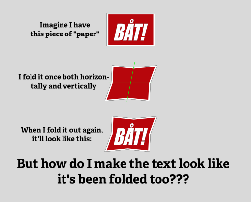
What if instead of the text there was only some squares. think about a line crossing the middle of the paper -how should it look after the distortion?
It cannot be all parallel to the edge of the paper.
If the edges of the paper are closer to the text, the effect would be more noticable.
acebone wrote:You guys are so good that you are doing things I don't quite understand - NOOB ALERT!!

There are at least a dozen small hints that can help drawing such an image, going them through could take an hour writing at least.
And most of those are just personal preferences you can gain by experience.
Espermaschine wrote:what is the best method to cut the combined path into the four needed segments ?
I used intersecting.

