Variable width stroke on letters?

Post questions on how to use or achieve an effect in Inkscape.
JimmyVolatile
Posts: 6
Joined: Tue Feb 03, 2009 7:33 am

Variable width stroke on letters?

Postby JimmyVolatile » Tue Feb 17, 2009 6:41 am

Hi.

I'm a wannabe Adobe Illustrator convert 8-) who wants to start using Inkscape for all of my illustration work as soon as possible. The vast majority of my work revolves around cartoon-like illustrations ( Example: http://dl.getdropbox.com/u/292603/game_tile_%234.png (the tiles are about 5x5cm each)) for various children's board-games and the like. A quick assessment of Inkscape's features has lead me to believe that I could do these drawings just as well in Inkscape as in Illustrator but I have a bit of trouble trying to replicate the "variable width" stroke around the shapes and numbers on as seen in the example above.

Would it be possible to define my own stroke styles? Or is there any other techniques that I should try? For the sake of consistency between drawings, is there a way to apply the stroke as a configurable effect, a live path effect or a stroke of some sort?.

Any type of hint will be greatly appreciated. :)

Thanks.
Last edited by JimmyVolatile on Wed Feb 18, 2009 4:33 am, edited 2 times in total.

ivan louette
Posts: 215
Joined: Thu Aug 21, 2008 4:08 am
Location: Belgium

Re: Variable width stroke on letters?

Postby ivan louette » Tue Feb 17, 2009 8:06 am

At the moment it seems that the Live Path Effects are momentarily disabled to clean the code. But you could perhaps reach a convincing roughen lines with some turbulence effect like Roughen (soon moved to the "Basics" submenu as "Basic roughen").

ivan

JimmyVolatile
Posts: 6
Joined: Tue Feb 03, 2009 7:33 am

Re: Variable width stroke on letters?

Postby JimmyVolatile » Tue Feb 17, 2009 8:36 am

Ok. Sounds very good. I found the post about the 129 filter tests http://www.inkscapeforum.com/viewtopic.php?f=11&t=2601 and it was very useful. Seems like a type of "Roughen" filter almost does the trick.

Only thing is that Inkscape doesn't seem to support exporting images with anti-aliasing but I'm sure I can work around that by cranking up the resolution while exporting and then reduce it back down in GIMP or some other image editor to get some kind of "fake" anti-aliasing.

Thanks! :D

ivan louette
Posts: 215
Joined: Thu Aug 21, 2008 4:08 am
Location: Belgium

Re: Variable width stroke on letters?

Postby ivan louette » Tue Feb 17, 2009 8:55 am

JimmyVolatile wrote:Ok. Sounds very good. I found the post about the 129 filter tests http://www.inkscapeforum.com/viewtopic.php?f=11&t=2601 and it was very useful. Seems like a type of "Roughen" filter almost does the trick.

Only thing is that Inkscape doesn't seem to support exporting images with anti-aliasing but I'm sure I can work around that by cranking up the resolution while exporting and then reduce it back down in GIMP or some other image editor to get some kind of "fake" anti-aliasing.

Thanks! :D


I don't know what you mean ? Antialiasing export seems absolutely perfect for me ! I often open my png exported files in Gimp and at 100% zoom they are fantastic.

JimmyVolatile
Posts: 6
Joined: Tue Feb 03, 2009 7:33 am

Re: Solved: Variable width stroke on letters?

Postby JimmyVolatile » Tue Feb 17, 2009 6:27 pm

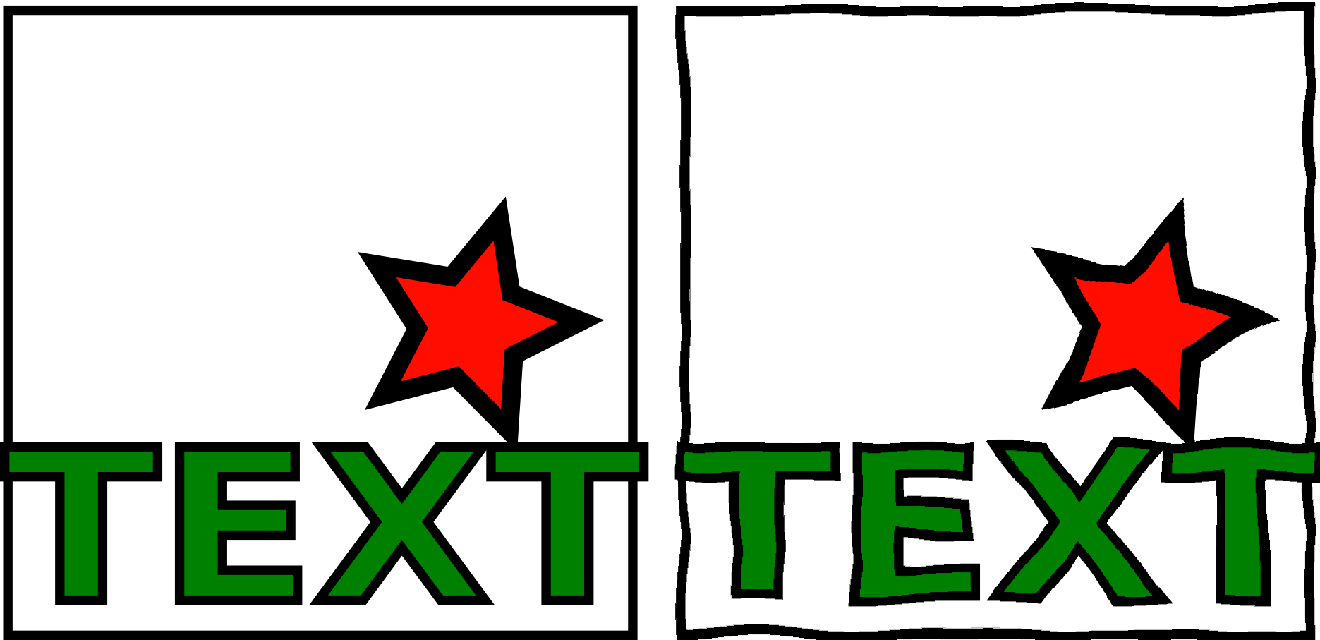
Yes, you're right. There is some kind of anti-aliasin going on. I was looking at the image using MaxView yesterday so any pixel with transparancy turned black. :oops:

However, if you look closely at the attached 600dpi image you can see that the horizontal strokes in the letterforms are still jagged. The anti-aliasing works well on the star but not so much so on any shape which is close to vertical or horizontal.

The anti-aliasing looks more like some kind of smoothing or slight blur. (Notice how there is a uniform 1 px 50% transparent black outline around the top of the "T" rather than pixels in multiple shades of black, as is the case around the black lines of the star. This is also the case with the large black square outline.)

On the duplicate shape with no effects applied, the anti-aliasing seems similar but here it works so well it's not really noticable.

Maybe it's because of the horizontal and vertical shapes of the letters. I'll try with another font and more shapes...
Attachments
roughen.svg
Inkscape file
(5.56 KiB) Downloaded 179 times
roughen_comparison_600dpi.png
Wierd anti-aliasing on the roughened letters
roughen_comparison_600dpi.png (60.03 KiB) Viewed 1783 times

JimmyVolatile
Posts: 6
Joined: Tue Feb 03, 2009 7:33 am

Re: Solved: Variable width stroke on letters?

Postby JimmyVolatile » Tue Feb 17, 2009 6:40 pm

I think I understand now. :)

Left shapes and letters are very nicely anti-aliased. The top left ping square is sharp at the bottom and slightly anti-aliased at the sides and top.

Filters used are turbulence and displacement map. Maybe it's got something to do with the resolution of the turbulence "texture"? Is there a way to set that separately in the preferences or the document?

The right shape and letters are anti-aliased but not according to their current shape. (Look at the bottom left flourish of the "T" in text.) It looks like the anti-aliasing is applied before the effect and, understandably, this makes the anti-aliasing look wrong after the displacement has taken place.

Maybe you know a better way to apply displacement filters and still keep the right anti-aliasing? :?:
Attachments
roughen_comparison_600dpi_2.png
Comparing anti-aliasing before and after roughen-effect is applied.
roughen_comparison_600dpi_2.png (99.24 KiB) Viewed 1780 times


Return to “Help with using Inkscape”