Drawing icon as Stroke
Drawing icon as Stroke
I follow a few icon artists. The Font Awesome guys were saying that they prefer to draw icon as Stroke rather than Fill. Let us assume that they use Illustrator or some other software but talking about the same Stroke and Fill on Inkscape. I wanted to ask, is there any benefit of drawing icons as Stroke rather than Fill ? Thanks.
Re: Drawing icon as Stroke
Hi.
Probably that's of the style they are aiming for -consistent widths, simplistic monochrome interface design.
Contrary I'm guessing technically that's a downside to store as "pure vectors" to use strokes instead fills. Strokes rely much on the renderer and can produce weird stuff. Not mentioning how transformations can still mess up their consistent widths too.
Also some typographers may add their experience. Constant width in geometry doesn't equal constant width or sharp appearance visually.
Think of how the hole is formed in the letter "A" -or the cross in "X".
Personally I'd still prefer fills only for final deliverables.
Edit: looking for references, found this:
making-geometric-type-work
Probably that's of the style they are aiming for -consistent widths, simplistic monochrome interface design.
Contrary I'm guessing technically that's a downside to store as "pure vectors" to use strokes instead fills. Strokes rely much on the renderer and can produce weird stuff. Not mentioning how transformations can still mess up their consistent widths too.
Also some typographers may add their experience. Constant width in geometry doesn't equal constant width or sharp appearance visually.
Think of how the hole is formed in the letter "A" -or the cross in "X".
Personally I'd still prefer fills only for final deliverables.
Edit: looking for references, found this:
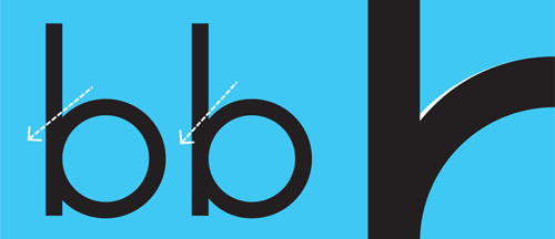
At the point where two strokes meet or cross each other, the join is liable to “clog up”. A typical example above, shows a circle attached to a vertical line to create a ‘b’. A heavy area appears where the curve tries to pull away from the straight. By trimming a little from the inside, it pushes the curve down in the right direction.
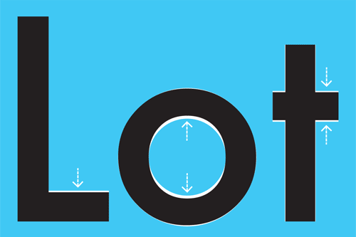
The horizontal and vertical strokes should not be the same thickness. If they are, the horizontal strokes will look heavier. An example above shows how a visually monolinear typeface such as Futura, has subtle adjustments to the horizontal strokes to make them appear even.
making-geometric-type-work
Re: Drawing icon as Stroke
Probably using different search tags but came across a similar solution to a merely production-wise problem on the bell font, where they included "ink traps".
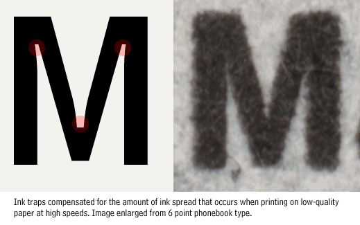
Guessing blurred vision works the same as ink spread so it helps focusing more and adds legibility.
Guessing blurred vision works the same as ink spread so it helps focusing more and adds legibility.