Tried to combine all kinds of lessons i learned into one piece. Not 100% satisfied with the colours...
Any suggestions for improvement ?
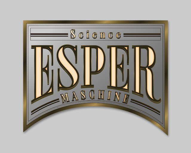
Archies
Re: Archies
Crossed hoverboards? Nah....
Compliments on a great job.
To me, colours are working just great. It looks kind of Feinkost exklusive but the secondary font is... well, outlines are covering letters and not quite improving the general look and feel.
It looks like you stacked a couple of these arched inscriptions but they are not evened and, as is - it doesn`t belong to this style. Perhaps simple duplicating or cloning would solve the thing?
Still, nice one - keep `em coming!
- Espermaschine
- Posts: 892
- Joined: Thu Jun 05, 2014 9:10 pm
Re: Archies
Thanks Maestral !
I think the problem is the shiny strokes dont work very well on the smaller text. Same with the inset.
Here is another version:
I think the problem is the shiny strokes dont work very well on the smaller text. Same with the inset.
Here is another version:
Re: Archies
It's risky to suggest something that depends much on personal taste.
My subjective opinion is it would be good going back to chalkboard calligraphy a bit.
By that you can concentrate more on the basic elements of the composition and lettering, and less on the fancy colours -which, by the way, look quite good.
Decide the proportions of the "strokes" being used to build up the lettering.
The crossbar in "A" looks way too thin, compared to all the thick outlines.
If those outlines are necessary at all.
Probably choosing different letter style to the large and small letters is a good idea, the small letters using the same -large- contrast as the large letters, doesn't really work in my humble opinion.
Be a bit more consistent on uppercase and lowercase letters.
The arched lettering is supposed to bring attention to the inner part of the composition, which you hardly used. The small letters on top doesn't help it come out either.
(Like this.)
There are alot great examples of good lettering, even though the use of such serif letters is not so common in general.
1, 2, 3, 4 just to name a few, there are a dozen more on pinterest.
- Espermaschine
- Posts: 892
- Joined: Thu Jun 05, 2014 9:10 pm
Re: Archies
Thanks Lazur for the comments !
I guess i could deliver a better job, if i had a concept for what i wanted to do like you showed in your post.
But, tbh, it was all done on the fly.
I watched Nick's Logos channel, there was this "sign", with arched text (done with the perspective extension), so i wanted to try something in that vein, and from there it all happened.
I agree, that especially text with strokes and insets need a bit of planning, to make it all work.
Something i didnt do at all.
Working with all the gradients became a bit tedious after a while. So thats when i stopped and made something else.
Re: Archies
Hi
Maybe change the spelling of "maschine" to the correct one - "machine" ?
Espermaschine wrote:Any suggestions for improvement ?
Maybe change the spelling of "maschine" to the correct one - "machine" ?
Good Luck!
( ͡° ͜ʖ ͡°)
RGDS
Ragnar
( ͡° ͜ʖ ͡°)
RGDS
Ragnar
Re: Archies
^ Geography says you`re closer to German native speakers than I am ,)
- Espermaschine
- Posts: 892
- Joined: Thu Jun 05, 2014 9:10 pm
Re: Archies
Maestral wrote:^ Geography says you`re closer to German native speakers than I am ,)
we have a winner here
Re: Archies
I like the first one better, without (or with less) blurring. I don't have any training in what makes "good art" or "bad art", but just how it looks to me, pleasing or not. I'm drawn to the thin dotted line, which I like, and the metalic gradient on the outer thick border of the shield. I think I might be tempted to make the thick, dark gold border of the letters, and those dark bars, to have the same appearance as the thick gold border of the shield. And carry the same gradient across all. And all have a slight shadow, as if they are raised.
The thing I notice the most, which shows more on the 1st one, is at the bottom of the large letters. There's a thin, light strip in between 2 heavy dark bars. I think the bottom dark bar might be actually the drop shadow, which means that the thick, dark "stroke" as it were, is a separate object, and slightly misaligned. Actually, in a few other places, here and there, there's a thin light strip outside that dark border/stroke.
To me, those big letters have the appearance of being very heavy, solid and metalic. I don't know if that was your intention or not, but that thin light strip takes away from them seeming solid. It could be you used a filter on some parts, and sometimes filters can add those little odd glitches.
Of course, change the colors to something like green, and it might not look metalic at all. But that's just how it seems to me.
Basics - Help menu > Tutorials
Manual - Inkscape: Guide to a Vector Drawing Program
Inkscape Community - Inkscape FAQ - Gallery
Inkscape for Cutting Design
Manual - Inkscape: Guide to a Vector Drawing Program
Inkscape Community - Inkscape FAQ - Gallery
Inkscape for Cutting Design
- Espermaschine
- Posts: 892
- Joined: Thu Jun 05, 2014 9:10 pm
Re: Archies
brynn wrote:To me, those big letters have the appearance of being very heavy, solid and metalic. I don't know if that was your intention or not, but that thin light strip takes away from them seeming solid. It could be you used a filter on some parts, and sometimes filters can add those little odd glitches.
Thanks Brynn !
I didnt use any filters.
The shiny effect comes from a reflected gradient on the stroke, which is something i learned from studying Photoshop texteffects and trying to apply in Gimp.
You know all my experience with Gimp is really helping me a lot with these kind of effects, although i feel its hard to get right.
Speaking of dropshadows, there is a lot you can do in texteffects with shadows and glows which arent really accurate when it comes to direction of light, but still look good and make a difference when it comes to contrast.
If y'all are interested i can upload the svg file.