No. 0.91 pencil

Show off your finished Inkscape work.
Lazur
Posts: 4717
Joined: Tue Jun 14, 2016 10:38 am

No. 0.91 pencil

Postby Lazur » Wed Oct 01, 2014 7:20 am


User avatar
Maestral
Posts: 982
Joined: Sat Aug 27, 2011 7:10 am

Re: No. 0.91 pencil

Postby Maestral » Wed Oct 01, 2014 8:58 pm

^ MM, nice one - Congratulations!
:tool_zoom: <<< click! - but, those with a cheaper tickets should go this way >>> :!:

Lazur
Posts: 4717
Joined: Tue Jun 14, 2016 10:38 am

Re: No. 0.91 pencil

Postby Lazur » Wed Oct 01, 2014 10:09 pm

Thank's!

User avatar
brynn
Posts: 10309
Joined: Wed Sep 26, 2007 4:34 pm
Location: western USA
Contact:

Re: No. 0.91 pencil

Postby brynn » Thu Oct 02, 2014 2:10 am

Good work!!

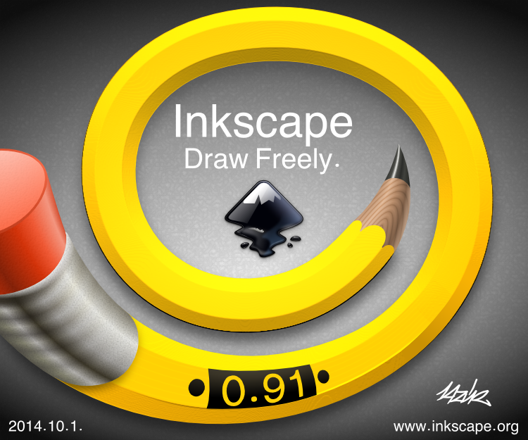
I guess it's finished.... But I could see some markings in the metal ring below the eraser. Maybe you could put some measuring marks, with crimped rings or pattern in the metal? I do like the tip much better that the original! And really nice background texture!

Ooohh.....to make the eraser look like it's been used to erase something, use the Eraser tool! Sorry. Oooh....I know -- draw an eraser, to look like it's erasing the eraser, lol. Really, sorry -- got a little silly....

But seriously -- It's a very clean design. But maybe a little too clean? The only thing close to a flaw -- or maybe it's just me...but it seems like there's too much of a shadow, between the metal strip the the pencil.

I really like what you did with the Inkscape logo! In general, I've never liked the logo. But that's the best representation I've ever seen. (I tried to get something like that for the header at IC, but didn't quite hit the mark.)

Well, congrats on a great result, and good luck for the competition :D

Lazur
Posts: 4717
Joined: Tue Jun 14, 2016 10:38 am

Re: No. 0.91 pencil

Postby Lazur » Thu Oct 02, 2014 4:11 am

Thank's!

There are alot of details to improve/to be redrawn clearly.
To me it seems that the energy it takes grows exponentially with the quality.

Where the metal reaches the wood, it should have been a bit thicker -if at least-, like, on the other end, with the eraser.
The same path was used with different gradient fills and masking to achieve the look, which was faster than drawing separate paths.

In general I'm happy with the efforts afforded/image consistency ration, and that it could still be submitted on time.
If it wasn't for this contest I may make some changes on it to improve sometime.
Or I don't know. I wouldn't have drawn that much of a "9" shape then.
Which spiral shape also reflecting the current about screen image in a way.


Edit:
Nearly forgot. The logo was taken without any modifications from a link given in the comments of the contest announcement.
http://commons.wikimedia.org/wiki/File:Inkscape_Logo.svg

User avatar
Dillerkind
Posts: 386
Joined: Tue May 10, 2011 10:22 pm
Location: Germany
Contact:

Re: No. 0.91 pencil

Postby Dillerkind » Sat Oct 04, 2014 4:59 am

The pencil itself looks great. The wooden part around the tip, the lighting/shading and all. The eraser as well as the metal piece connecting it to the pencil look different... I mean style-wise. They appear kinda cartoon-ish, while the pencil looks pretty realistic. Another thing that caught my attention is that black line under the two lower curves of the pencil. I like the idea. It's simple but funny nonetheless. Good luck for the contest. I still have to decide between your pic and another one ;D
... My blog ... << Come visit me :) >> ... My thread ...

Lazur
Posts: 4717
Joined: Tue Jun 14, 2016 10:38 am

Re: No. 0.91 pencil

Postby Lazur » Sat Oct 04, 2014 5:31 am

Thank's!

The black line wasn't intentional at the bottom of the shape, that's how the diffuse filter handled the gradient.
Maybe it doesn't appear with the 0.91 renderer?
Could get rid of it only if the masking path was a bit thinner on the filtered object, and not exactly as wide as the bent gradient made with the markers.

I could argue on the stylistic inconsistency because looking at now it appears to me that the tip part is way off too -just it's smaller.
For example the wood texture indicates this pencil is about 15 times upscaled from a functional one, though as is, can convey better a wooden atmosphere.

User avatar
Dillerkind
Posts: 386
Joined: Tue May 10, 2011 10:22 pm
Location: Germany
Contact:

Re: No. 0.91 pencil

Postby Dillerkind » Thu Oct 09, 2014 5:13 am

I still think the main part of the pencil, including its tip, look quite realistic. Maybe I just wasn't clear about what exactly I meant. The eraser appears to have a thick colored outline, as opposed to the rest. This makes it looks rather cartoony imho. But either way, I didn't mean to make this a bigger issue than it actually is.

About that black line, yeah, might be a filter-related problem. I've seen all kinds of funky stuff caused by filters (or maybe rather the improper use of them in my case :D ) myself. I wanted to take a look at the svg but gave up at some point. After disabling a bunch of filters and stuff in order to improve performance when zooming in and panning, I was somewhat lost. Groups inside groups inside groups, filters, effects... Guess the same would happen if somebody else was digging through my files and trying to understand the way I organize my works :D
... My blog ... << Come visit me :) >> ... My thread ...

Lazur
Posts: 4717
Joined: Tue Jun 14, 2016 10:38 am

Re: No. 0.91 pencil

Postby Lazur » Thu Oct 09, 2014 9:24 am

Oh I get it now. There a torus-like surface would be precisely, which would have needed other shade bending, probably blurring and clipping.
Tried not to use blurring for such effect, because the yellow object could be made with that too.
That was the main part, to showcase the trick -adding a 3D look without colouring spots one by one.
Not that it couldnt produce, or produce an even more polished/stylish feel, but this way changing the lightsource can be done anytime on the filtered parts.

About the effect, I do understand that it can look as an overblown nonsence, and crawl the system.
Glad you tried to open the svg. By looking at the download count, people in general seem not realising the brute-force behind to make the filter work.
Should have made something more complicatedly looking. But sadly this was only on my mind, and the effort put inside it was enough for me.

Added a new article on the general technic at inkscape community, will be up soon hopefully.
-edit: here it is: http://forum.inkscapecommunity.com/index.php?action=articles;sa=view;article=24-

Also, have split apart that yellow part and uploaded the svg to openclipart, this may give a better insight:
https://openclipart.org/detail/203126/bent-pencil-effect-by-lazur-urh-203126
ait
Posts: 138
Joined: Wed Apr 30, 2014 2:13 am

Re: No. 0.91 pencil

Postby ait » Tue Nov 25, 2014 1:27 am

Lazur,
This looks great
how did you do the pattern part on the pencil tip?
and what about how did make the wood grain pattern on the yellow part of the pencil?

Also, I downloaded your original svg from the link (https://openclipart.org/detail/202585/n ... urh-202585) and I was surprised to see you don't use any layers? Really, you don't?

thanks...understanding how people create their imagery helps me so I appreciate your time.
best
a

Lazur
Posts: 4717
Joined: Tue Jun 14, 2016 10:38 am

Re: No. 0.91 pencil

Postby Lazur » Tue Nov 25, 2014 1:54 am

Thank's!

The wood texture on the tip is made up by two radial gradients above eachother.
The yellow part was made with the diffuse filter, the grain pattern is the result of its limitation.
Or the lack of my experience with filter editing for that matter.
I hardly use filters but this was overblown with them.
And almost never use layers.

ait
Posts: 138
Joined: Wed Apr 30, 2014 2:13 am

Re: No. 0.91 pencil

Postby ait » Tue Nov 25, 2014 5:24 am

Hi Lazur,
thanks for your answers...
I'm not sure how you used the two radial gradients on top of one another. I'll have to experiment with that. Also, I mean the wood part of the tip (not the graphite). Is that what you thought I meant? Either way, I'm still confused as to how you made the wood part of the pencil tip.

Really, you don't use layers? wow...I mean I know they slow (my machine) down if I have too many layers (and it's a complicated file to start with) but I find them useful to be able to move and edit one thing without touching something else.
However, layers may also be more useful to a beginner like myself who is isn't always sure how to set things up and needs to make changes. I guess if you know what you're doing you may not need layers as much.

at any rate, I appreciate your response..
best
a

Lazur
Posts: 4717
Joined: Tue Jun 14, 2016 10:38 am

Re: No. 0.91 pencil

Postby Lazur » Tue Nov 25, 2014 6:50 am

Here is the tip of the pencil, chopped from the rest:
https://openclipart.org/detail/205048/
Wood texture: above a base fill with a radial gradient there is another one in the same position, but with darker shades, masked with a different radial gradient.
Other solution could have been changing the blend mode of the object that is now used for masking.

Layers are like groups, for simple organising it is just unnecessary pain in my humble opinion. It can be useful if you want to hide objects that may crawl the drawing. In which case, I would change the display mode to outlines only instead.
Hmm thinking it over, for showcasing how the image was built up it could be useful.
Maybe next time, for release 1.

ait
Posts: 138
Joined: Wed Apr 30, 2014 2:13 am

Re: No. 0.91 pencil

Postby ait » Wed Nov 26, 2014 1:30 am

Hi Lazur,
Thanks for the clip of the pencil..
Ya know, what you see on the Clipart isn't the same as what you get when you open the SVG file...btw..

Anyway, returning briefly to the tangent on layers...the way I use them is say there's something I want to change but it's below something else. However, I don't want to move the imagery on the top. If I have layers on (and they're set up the right way) I can lock or even hide the top layers and edit something at the bottom without effecting what's on the top (for example, having to reposition it or clicking on it by accident). Anyway, I find that useful but it may not be for everyone..tangent.

Again, thank you for the link to the pencil tip. I'll spend some time looking at how you created it. However I'm still confused: I understand the radial graident on the black/gray section. But then on the wood section I don't see how you got those lines to appear. Upon further thought...I don't think I know what you mean by " masked with a radial gradient." I'll have to do some searching....and/or your thoughts would be appreciated...? thank you
best
a

Lazur
Posts: 4717
Joined: Tue Jun 14, 2016 10:38 am

Re: No. 0.91 pencil

Postby Lazur » Wed Nov 26, 2014 2:20 am

That svg contains it all, download and open it with inkscape.
Then you can select each object; the indication bar will tell most of the details.


A workaround to select hidden objects is Alt+clicking, or using outline only display mode and the node tool.
Or changing the z-order temporarily by Pgup/Pgdown.

But with layers, you would need to toggle each layer's visibility on and off, just to find the right objects, hide the layers at the top, unlock layer below to select, then maybe go back to the top layers, change them back to visible and lower their transparency and lock them.
Moving objects from one layer to another or changing the layer's order is too strict too in my humble opinion.

ait
Posts: 138
Joined: Wed Apr 30, 2014 2:13 am

Re: No. 0.91 pencil

Postby ait » Wed Nov 26, 2014 4:36 am

Hi Lazur,
Yes, I know the Svg contains it all. But I just wanted you to know on the Clipart page part of the image is gone.
If you don't mind...could you help me understand the masking with a radiant graident part?
(and good tips on the layers...I'll try that)
thanks
a

Lazur
Posts: 4717
Joined: Tue Jun 14, 2016 10:38 am

Re: No. 0.91 pencil

Postby Lazur » Thu Nov 27, 2014 10:06 am

Hi.

Openclipart makes raster copies for thumbnails, and browsers cannot render svg-s as much inkscape can.
Like, they only display the area between the page borders.
I didn't set that around all the objects because it would look messy for a thumbnail image in my humble opinion.


Just wrote an article on drawing wood texture at inkscapecommunity:
http://forum.inkscapecommunity.com/index.php?action=articles;sa=view;article=26

Here is the base figure of it:
https://openclipart.org/detail/205214/wood-texture-by-lazur-urh-205214

ait
Posts: 138
Joined: Wed Apr 30, 2014 2:13 am

Re: No. 0.91 pencil

Postby ait » Tue Dec 02, 2014 6:25 am

Hi,
Thanks...so I was looking at the clip and I took apart the parts of the ball to better understand it. However, I still don't understand how you got the lines on the base ball. I put a red circle specifically around the part confusing me. I believe that pertains to the "masking with a radial gradient" that you mentioned but I'm not sure.

Also, I don't understand how when you move some of the handles the shapes alters(see blue arrow). However, sometimes when you move the handle nothing happens (see green arrow).

thoughts?

Ok...I don't see how to attach an image here so my comments don't make sense...nevertheless, you probably understand...
thanks
a

Lazur
Posts: 4717
Joined: Tue Jun 14, 2016 10:38 am

Re: No. 0.91 pencil

Postby Lazur » Tue Dec 02, 2014 7:25 am

Maybe my wording wasn't correct.
Masking a path with another path, which has a gradient fill.
Some gradient handles may look off, don't know why, some cases they also transform and differ from the regular 90° angle to eachother.

Maybe I should have emphasise more that the masking object's gradient -that creates the somewhat parallel lines-
is a gradient which is repeated.
Also the centres were pulled off from their regular position.

See the right part of the manual
Image
and
Image


Return to “Finished Inkscape Work”