Hi.
Am working on a Newsletter.
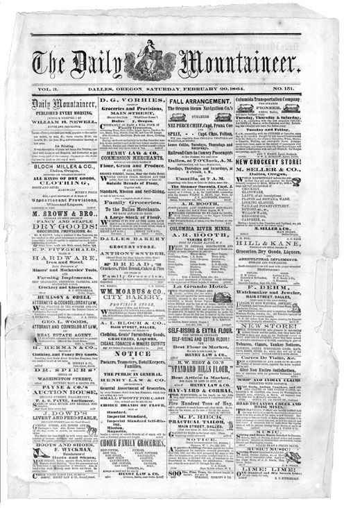
I want it to look like an old (Victorian/Western) Newspaper (see attached image).
I have designed the attached layout with Scribus, but am not happy with the lines- they are too clean looking for the document and clash aesthetically with the fonts.
Any ideas on how to generate lines of the approximate size, but a little knicked up and flawed?
Thanks.
Suggestions for dirtying up some lines.
Re: Suggestions for dirtying up some lines.
You can convert your lines to paths (if they're not already) then add nodes (you'll want a bunch, probably 100s per line) then play with "jitter nodes" under effects. That might give you the look you're going for.
Last edited by llogg on Wed Jan 28, 2009 12:25 pm, edited 1 time in total.
Re: Suggestions for dirtying up some lines.
llogg wrote:You can convert your lines to paths (if they're not already) then add nodes (you'll want a bunch, probably 100s per line) then play with "jitter nodes" under effects. That might give you the look your going for.
I would take this idea a little further. Make two identical lines (that overlay each other perfectly) then do as llogg has said to one of them. Then select both lines and apply the Intersection path operation on them. This will get you a line that has both perfectly straight sections with nicks (as opposed to a line with no straight sections at all).
Re: Suggestions for dirtying up some lines.
That's a great idea, microugly.
Edited to add the quick example I did following microugly's tip.

Here are the steps I used:
1. Using I drew a straight line.
2. I selected Effects>Modify Path>Add Nodes. You can customize the settings however you'd like, I used a max segment length of 1 pixel and got a total of 520 nodes.
3. Duplicate the path.
4. Select the top path and do Effect>Modify Path>Jitter Nodes. Again, play with the settings to your desire. I used max displacement of about 2.2 px.
5. Select the other path and do the same to it. (You might be able to do them simultaneously, I don't know. I intuitively did it this way because I thought it might introduce more randomness to do them separately. Also, microugly suggested only doing this to one path but I felt like this approach gave more of that imperfect industrial revolution printing press feel. Your mileage may vary.)
6. Select both paths and align them.
7. With both paths selected do Paths>Intersection. Done.
Thanks microugly for the tip.
Edited to add the quick example I did following microugly's tip.

Here are the steps I used:
1. Using
 I drew a straight line.
2. I selected Effects>Modify Path>Add Nodes. You can customize the settings however you'd like, I used a max segment length of 1 pixel and got a total of 520 nodes.
3. Duplicate the path.
4. Select the top path and do Effect>Modify Path>Jitter Nodes. Again, play with the settings to your desire. I used max displacement of about 2.2 px.
5. Select the other path and do the same to it. (You might be able to do them simultaneously, I don't know. I intuitively did it this way because I thought it might introduce more randomness to do them separately. Also, microugly suggested only doing this to one path but I felt like this approach gave more of that imperfect industrial revolution printing press feel. Your mileage may vary.)
6. Select both paths and align them.
7. With both paths selected do Paths>Intersection. Done.
Thanks microugly for the tip.
Re: Suggestions for dirtying up some lines.
You're adaptation works really well to create a fine line. Following my own steps, this effect I had in mind for a thicker line:
I think it's funny I extended your idea then you extended mine I actually wouldn't have thought to do this if not for your original suggestion. There's clearly a few very convincing effects that can be produced in Inkscape. These lines would work wonderfully with LPE.
I think it's funny I extended your idea then you extended mine
Re: Suggestions for dirtying up some lines.
yeah that looks really nice for a good thick line.
-
iamshawnrice
- Posts: 11
- Joined: Sun Oct 05, 2008 6:08 am
Re: Suggestions for dirtying up some lines.
Brilliance! Thanks.
Re: Suggestions for dirtying up some lines.
This technique is very nice, but each time that I do the intersection operation the whole thing dispapears. The only way that seems to work, but not as expected is to jitter both lines, but you end up with a solid line with jittered boundaries without nicks.
Re: Suggestions for dirtying up some lines.
Not sure why it's not working for you. Can you list the steps you're taking? And maybe give a sample of the results?
Re: Suggestions for dirtying up some lines.
I believe it is exactly as you have described with the exception of jittering both paths. If I do that I end up with a line that looks like it has barbs coming from it instead of a distressed look.
1. I take the and create a straight horizontal line
2. Menu item Extensions>Modify Path>Add Nodes. (I choose max segment 1 and end up with 376 nodes)
3. Duplicate object and Extensions>Modify Path>Jitter Nodes. (Max displacement x 2.2 y 2.2)
4. Select both paths and align centered horizontally and vertically.
5. While still selected Path>Intersection
6. Result everything disappears.
I am using a 10px wide stroke.
1. I take the
 and create a straight horizontal line
2. Menu item Extensions>Modify Path>Add Nodes. (I choose max segment 1 and end up with 376 nodes)
3. Duplicate object and Extensions>Modify Path>Jitter Nodes. (Max displacement x 2.2 y 2.2)
4. Select both paths and align centered horizontally and vertically.
5. While still selected Path>Intersection
6. Result everything disappears.
I am using a 10px wide stroke.
Re: Suggestions for dirtying up some lines.
I think a step is missing here, you need to turn stroke into a path, or draw a rectangle instead of the line. No matter how thick the line it only has one array of nodes, it doesn't create an area when overlapping with another line so it disappears when doing intersection.
just hand over the chocolate and nobody gets hurt
Inkscape Manual on Floss
Inkscape FAQ
very comprehensive Inkscape guide
Inkscape 0.48 Illustrator's Cookbook - 109 recipes to learn and explore Inkscape - with SVG examples to download
Inkscape Manual on Floss
Inkscape FAQ
very comprehensive Inkscape guide
Inkscape 0.48 Illustrator's Cookbook - 109 recipes to learn and explore Inkscape - with SVG examples to download
Re: Suggestions for dirtying up some lines.
prkos wrote:
I think a step is missing here, you need to turn stroke into a path
That is the missing step when using the pen tool.
Re: Suggestions for dirtying up some lines.
ahhh. I used the bezier tool. Good catch prkos
 This is a read-only archive of the inkscapeforum.com site. You can search for info here or post new questions and comments at


