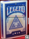
[solved] How to create this effect?
Re: How to create this effect?
Type the text you want,
convert it to a path (Ctrl+C),
ungroup it (Ctrl+Shift+G),
combine it, (Ctrl+K),
and duplicate it (Ctrl+D).
Draw a path wich you want the text to be distorted,
adjust it's size to be wider than the text.
Select the duplicant, move it to top (Home),
add the path below to the selection, and
run the pattern along path extension, with unstreched ribbon settings.
Then cut off the unnecessary parts of the two text object,
andjust their position and stich them together.
Re: How to create this effect?
It's not working
Maybe I'm doing something wrong. If you record video instructions to do this I'll be very grateful.
Re: How to create this effect?
You could also try Path Effect / Envelope Deformations
(first - font converted to path Ctrl+Shift+C/ then Ctrl+Shift+G / and Ctrl++)
Note that not all the fonts are suitable for this kind of deformation (you may see in the example that all "important" features of the font are shifted up, so curve at the bottom affects only some basic shapes and that way keeps the inscription readable).
I`ve added the extra node, at the middle, but it depends how much you`ll need to modify your letters. Aside of adding that node, I`ve just selected nodes of the bottom bend path and moved them up. Further deformation / more curved shape of the base / requires better preparation of the letters before applying the effect or node editing after that. Reducing nodes is also a good treat, since the deformations and node editing would be less annoying. Chose the font wisely and you`ll help your self a lot ,)
Re: How to create this effect?
The tool that I use most often for stuff like this is the BezierEnvelope2010 extension (http://bit.ly/bdcIz9). Of course there are several ways to achieve this but Gerrit Karius's extension gets you awfully close with maybe a bit of tweaking afterward.
- Attachments
-
- arc_text.svg
- (271.5 KiB) Downloaded 313 times
Re: How to create this effect?
Excellent one. Thanks heathenx!
Re: How to create this effect?
I forgot to include that the font I used already had a lot of nodes after it was converted to a path and combined (http://www.dafont.com/cast-iron.font). Sometimes adding more nodes to the text object will yield a better result.
Re: How to create this effect?
Perhaps it`s just me, but when I apply Envelope on combined shape - Inkscape freezes?! That`s why I`m thankful for this new one.
Re: How to create this effect?
Maestral wrote:Perhaps it`s just me, but when I apply Envelope on combined shape - Inkscape freezes?! That`s why I`m thankful for this new one.
It's not just you. This as well as the Perspective effect have been an issue on the Windows versions for a very long time...years in fact. Fortunately for me, the Linux version works well. BezierEnvelope is a bit buggy too but at least it doesn't lock up your session.
Re: How to create this effect?
Guys thanks for your help! Special thanks to heathenx
- Espermaschine
- Posts: 892
- Joined: Thu Jun 05, 2014 9:10 pm
Re: [solved] How to create this effect?
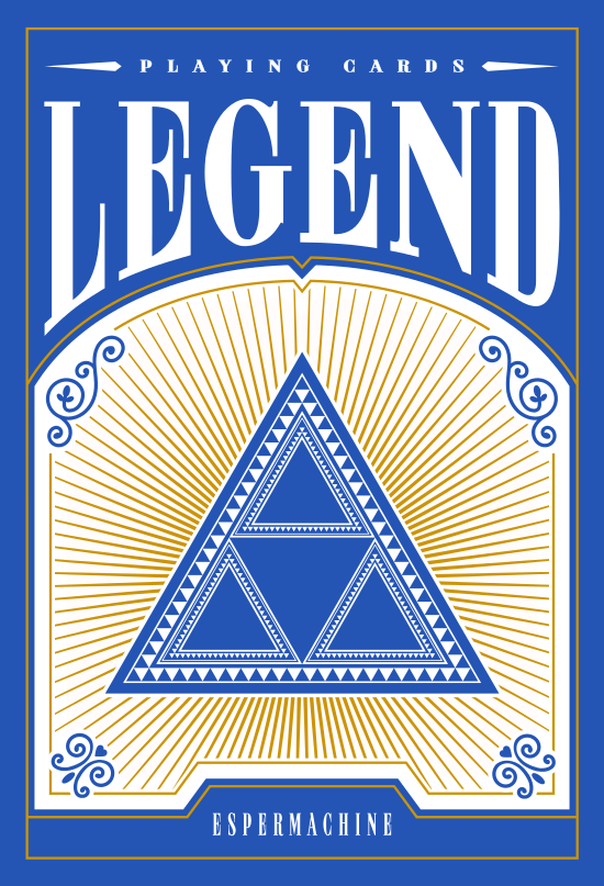
I couldnt get the extension to work. The text got wrapped around the frame, like flying through a black hole
So instead i used the Lazur method.
The whole thing took me about 10h
So instead i used the Lazur method.
The whole thing took me about 10h
- Attachments
-
- rect24644.png (248.24 KiB) Viewed 6762 times
Re: [solved] How to create this effect?
Boy oh boy... can`t you tell this thing is solved? ,) [pun intended]
* NOTE *
Unlike Bezier Envelope extension, Inkscape would most commonly prefer 4123 sequence*/**. If you enable Path direction (Preferences/Tools/Node), you`ll see the difference - since these paths are drawn in opposite directions, which affects the final results. In order to achieve the proper result you should first select the object which you plan to deform and than the path. Also, keep it down to just 4 nodes - otherwise, you`ll boldly go where your desired results have never been before ,)
I had to check if z order affects the result and it doesn`t, only the sequence of selecting. Also, as mentioned earlier, adding nodes largely improves results while I also dragged down a lower portion of the text before adding nodes. As you may see, some portions would need some tweaking but....
...this whole example was made in about 10 minutes.
* edited after Espermachine`s comment
** and then again, to make it right ,)
Last edited by Maestral on Sun Jun 07, 2015 9:03 pm, edited 2 times in total.
- Espermaschine
- Posts: 892
- Joined: Thu Jun 05, 2014 9:10 pm
Re: [solved] How to create this effect?
Thanks Maestral, that helped.
But i still have questions:
I thought it was 4123 for the perspective extension ?
I dont get the path direction thing in the preferences. Cant find it it in the manual.
Can you explain what it does, please ?
Yeah, that was the problem, i had one extra node for the curvature, and then it was: Mr. La Forge, engage !
But i still have questions:
Maestral wrote:* NOTE *
Unlike Bezier Envelope extension, Inkscape would most commonly prefer 1432 sequence.
I thought it was 4123 for the perspective extension ?
If you enable Path direction (Preferences/Tools/Node), you`ll see the difference - since these paths are drawn in opposite directions, which affects the final results.
I dont get the path direction thing in the preferences. Cant find it it in the manual.
Can you explain what it does, please ?
Also, keep it down to just 4 nodes - otherwise, you`ll boldly go where your desired results have never been before
Yeah, that was the problem, i had one extra node for the curvature, and then it was: Mr. La Forge, engage !
Re: [solved] How to create this effect?
Indeed, it is 4123 - my bad/lapsus
Path direction is just the way to...
Re: [solved] How to create this effect?
Espermaschine wrote:The whole thing took me about 10h
Holy Semprini!
The result looks quite good, guess the original one wasn't drawn in a shorter time.
Speaking of the original, maybe a better source image would be a boost?
original deck
After a little cleanup:
(standard poker size deck)
Maestral wrote:Boy oh boy... can`t you tell this thing is solved? ,) [pun intended]
At least my edit in the title was only putting the [solved] tag from the end to the start, as it was marked solved by GPN already.
Edit: Anyone wondering why this got bumped, here was a similar topic recently.
- Espermaschine
- Posts: 892
- Joined: Thu Jun 05, 2014 9:10 pm
Re: [solved] How to create this effect?
Lazur URH wrote:Espermaschine wrote:(standard poker size deck)
I didnt plan to recreate the deck of cards. Just followed your link to this thread and wanted to try the pattern around the triangle.
That lead to making the whole image and the text is something i did last
So the whole thing grew and grew and i expanded the canvas when necessary.
Oh and googling for a better image was the first thing i did
Re: [solved] How to create this effect?
Since heathnx's link to the extension seems to be dead - I just found it here: (It's the Bezier Envelope extension, which is different from Extensions menu > Modify Path > Envelope) https://github.com/lemasney/Bezier-Enve ... master.zip And this might also be helpful: https://cleversomeday.wordpress.com/201 ... xtwarpink/
Basics - Help menu > Tutorials
Manual - Inkscape: Guide to a Vector Drawing Program
Inkscape Community - Inkscape FAQ - Gallery
Inkscape for Cutting Design
Manual - Inkscape: Guide to a Vector Drawing Program
Inkscape Community - Inkscape FAQ - Gallery
Inkscape for Cutting Design