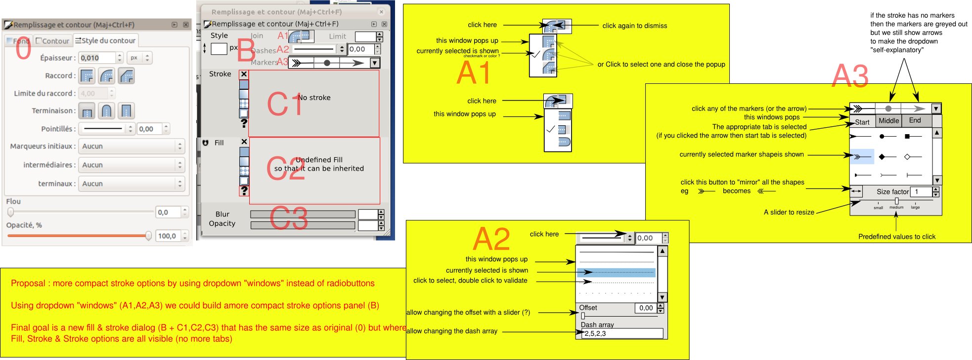
Proposal : more compact stroke options by using dropdown "windows" instead of radiobuttons
Using dropdown "windows" (A1,A2,A3) we could build amore compact stroke options panel (B)
Final goal is a new fill & stroke dialog (B + C1,C2,C3) that has the same size as original (0) but where
Fill, Stroke & Stroke options are all visible (no more tabs)
Proposal : compact stroke options
Proposal : compact stroke options
- Attachments
-

- proposal-compactstrokeoptions2.jpg (213.29 KiB) Viewed 3838 times
Re: Proposal : compact stroke options
Looks good to me!
Re: Proposal : compact stroke options
It seems like I saw a new feature request for either smaller buttons in the F/S dialog, or a smaller dialog. I don't remember which it was. I know that they are reworking the Gradient tool interface and options, and I've seen a comment somewhere about putting the gradient options into the F/S dialog. I don't know the current state of either discussions or work. But you could certainly search Launchpad, and learn a lot about it.
I think having all the current options visible, without using tabs, would certainly be less confusing for new Inkscape users. And probably more convenient for more experienced. As long the proposed new options aren't smaller than any other Inkscape content, I have no objections. I just wouldn't want to have to start straining to see, or have to change screen resolution to make it easier to see and use.
I like how you have the End Cap and Join styles right next to each other. It gives sort of a visual cue to their use. But I don't understand the Markers dropdown. Will it have like 3 buttons/zones for each menu item? Or will it be more like 3 side by side dropdown menus?
Basics - Help menu > Tutorials
Manual - Inkscape: Guide to a Vector Drawing Program
Inkscape Community - Inkscape FAQ - Gallery
Inkscape for Cutting Design
Manual - Inkscape: Guide to a Vector Drawing Program
Inkscape Community - Inkscape FAQ - Gallery
Inkscape for Cutting Design
Re: Proposal : compact stroke options
> But I don't understand the Markers dropdown. Will it have like 3 buttons/zones for each menu item?
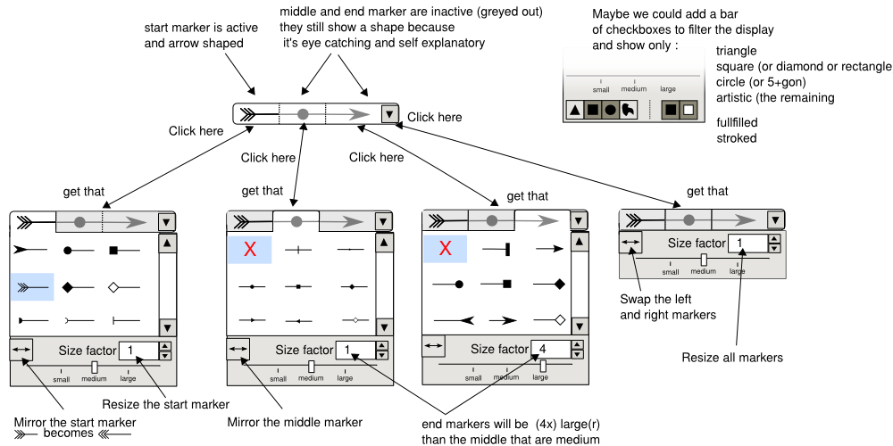
I'm not sure I understand what you mean. I hope attached proposition will clarify things
I removed the text tabs that led to confusion
> Or will it be more like 3 side by side dropdown menus?
In fact (now) there are 4 side by side drop down menus.
The dropdown arrow was there to give visual clue that there is a dropdown
eventually I used it to modify settings for all markers (start,middle,end)
- Attachments
-

- markers-dropdown.png (136.45 KiB) Viewed 3723 times
 This is a read-only archive of the inkscapeforum.com site. You can search for info here or post new questions and comments at