Hello all
I've been using Inkscape for a couple of years, mostly to create icons for my
SketchUp extensions. Though Inkscape is very useful I've never very much enjoyed using it due to its interface. I think there are quite a few things that could be improved to make the program easier and more fun to work with, as well as making it appear more professional. Not to mention making it more accessable.
As a 10+ years SketchUp user a lot of these examples are naturally from SketchUp, but much of this comes from other programs too.
Here are a few things I've noticed (or more accurately, have been unable not to be distracted by) in the UI. Most issues are related to noise, lack of visual hierarchy or lack of consistency, and these are closely intertwined with the latter drastically increasing the sense of noise.
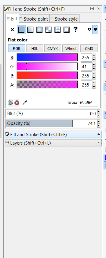
Visual hierarchy among dialogsIn the left side dialog tray I often struggle to see what controls belong to what panel. The slider inputs, with their color, is more prominent than the dialog titlebars. Would it be possible to change the titlebar background color, and perhaps tune down the slider color a bit?
Noise in dialogsI would also very much like to collapse docked dialogs when I don't use them to reduce the noise (but have them available when I need them a few seconds later). The current button things looks a bit like colalapsable title bars mixed with buttons but work like tabs but also contain a small arrow indicating a progressive disclosure and this turned into a very long sentence. It is not very clear from their appearance what these elements do, and they seem unable to collapse all dialogs. Would it be possible to some day have a tray with a series of dialogs, all colalapsable using their title bar, as SketchUp or LayOut does?
 2018-04-08_13h41_29.png
(24.6 kB . 352x853)
(viewed 220 times)Inkscape gets noisy ay just 2 dialogs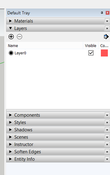
 2018-04-08_13h51_28.png
(12.03 kB . 361x573)
(viewed 225 times)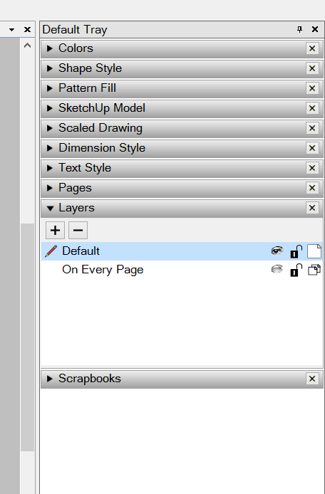
 2018-04-08_13h51_34.png
(19.4 kB . 456x694)
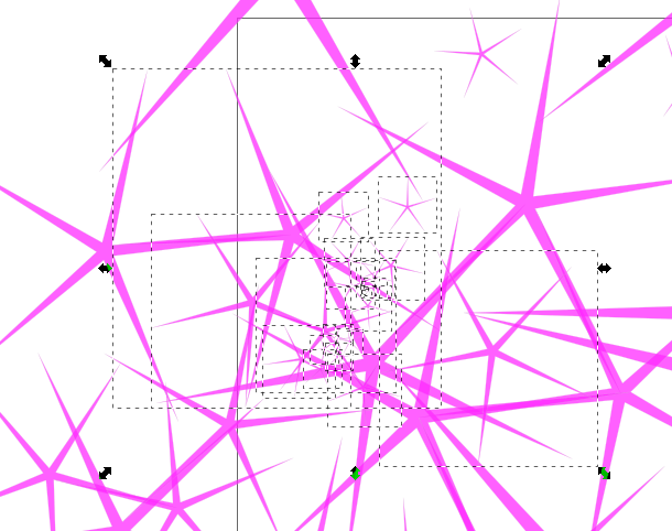
(viewed 223 times)SketchUp and LayOut can have 9 or 10 dialogs, and still look clean and be easy to useSelection feedbackI often find it hard to see what elements are selected, especially when selecting multiple partly overlapping objects.
Would it be possible to tint the color of the selected objects blue (the conventional color for selection) to make it clearer what exact elements are selected? The tint could be temporarily removed when colors are adjusted to allow you to see the actual color, but come back when the color control element loses focus (as in Paint.net).
 2018-04-08_13h57_42.png
(80.15 kB . 610x482)
(viewed 226 times)Unclear what elements are selected in Inkscape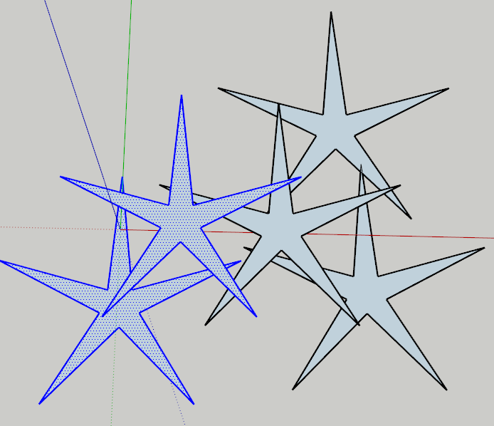
 2018-04-08_13h58_59.png
(32.22 kB . 694x598)
(viewed 215 times)Impossible not to see what is selected in SketchUpSelection tool actionsSeveral CAD applications uses box select from left to right to select only what is completely within the box, while selecting from right to left selects everything that is just partly inside the box too. This is highly useful and I'd very much like this in Inkscape too.
A tool mode that adds to the selection but doesn't subtract from it, regardless of the whether the clicked object is already selected, would also be very useful, especially as it is hard to see what is already selected. In SketchUp Ctrl is used for this (and Shift toggles while Ctrl+Shift only subtracts). Maybe Inkscape already has some similar feature and it is just me who don't get it. Otherwise this would be highly useful.
Too similar visibility icons for layersThe shown layer (open eye) and hidden layer(closed eye) look very similar when you don't look close. Would it be possible to lower the opacity of the hidden icon, as shown in LayOut above, to make it possible to see what layers are shown only with you peripheral vision?
 This is a read-only archive of the inkscapecommunity.com site. You can search for info here or post new questions and comments at inkscape.org/forums
  This is a read-only archive of the forum.inkscapecommunity.com site. This feature is no longer available.